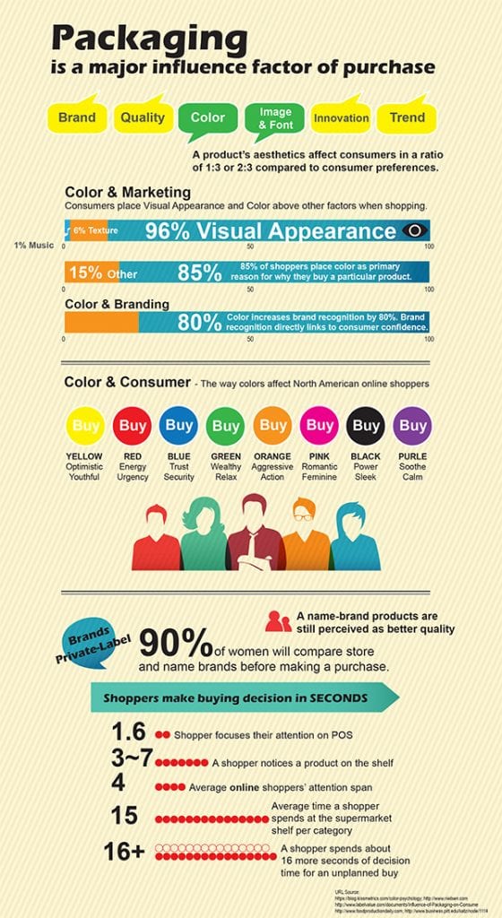
Effective packaging can attract new customers and keep existing ones. Packaging promotes and positions a new brand. In short, packaging is a major factor in our purchases. During a typical 30 minute shopping trip, consumers are exposed to an average of 20,000 different products. Impulse purchases make up about 40% of consumer spending. And out of this statistic, 14% of the total impulse purchase are food items, with shoppers saying they are often drawn in by product appearance. Packaging drives one-third of consumers’ purchasing decisions. So food packaging is an important, some might say critical component in a food processor’s supply chain.
So let’s look at packaging a bit more closely. What is the single most important product visual in a package? Color without a doubt. See chart below for a breakdown of color meanings and what each color evokes in consumers. In general, the color of a package should match the target market. For example, consider candy packaging – bright colors attract children’s eyes, so vibrant reds, bright blues and sunny yellows are often used. Green is often used for healthy products, since as a color green connotes nature and health. And of course, everyone knows the Coca-Cola red can. Red implies energy and urgency, and perfectly fits this iconic soft drink.
Shapes are another interesting part of product packaging. Interesting packaging shapes get attention on the shelf. For a long time, butter, margarine and cream cheese manufacturers used round tubs to package their product. The introduction of in-mold labeled packaging in North America led to these products being packaged in rectangular in-mold containers that stack efficiently and display better on the shelf. This dramatically changed the entire category, with more producers following suit and packaging their product in eye-catching rectangles and squares.
Graphic design elements, such as typography, are also very important. Good graphic design conveys the feeling and meaning behind the brand better than anything else. For example, a letterpress-look on labels connotes homemade and locally sourced product. This appeals to today’s consumers, who are drawn to hand made and personal products. Larger processors have taken notice and are adapting their packaging to reflect the trend. Note the label design of Vlasic Farmer’s Garden line of pickles.
Successful food packaging is well designed with careful consideration given to color, shape and graphic elements. Taking all of these elements into consideration will result in a successful food package that makes your product move from the shelf to a shopper’s cart.
https://www.thekitchn.com/outsmart-food-label-colors-while-you-shop-tips-from-the-kitchn-208689
https://www.cpgtrends.com/2011/05/three-ways-product-packaging-can-influence-consumers/


Leave A Comment